Data story
ROLE
Data Designer
EXPERTISE
Data Vis.
YEAR
2020
about this project
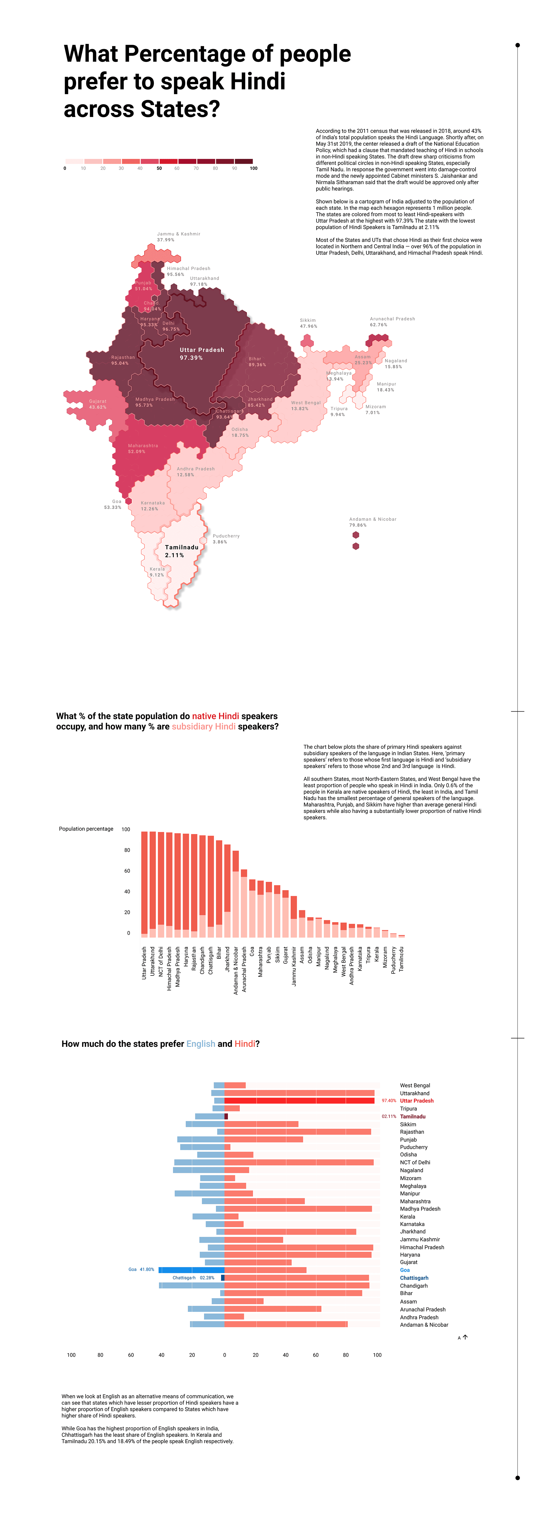
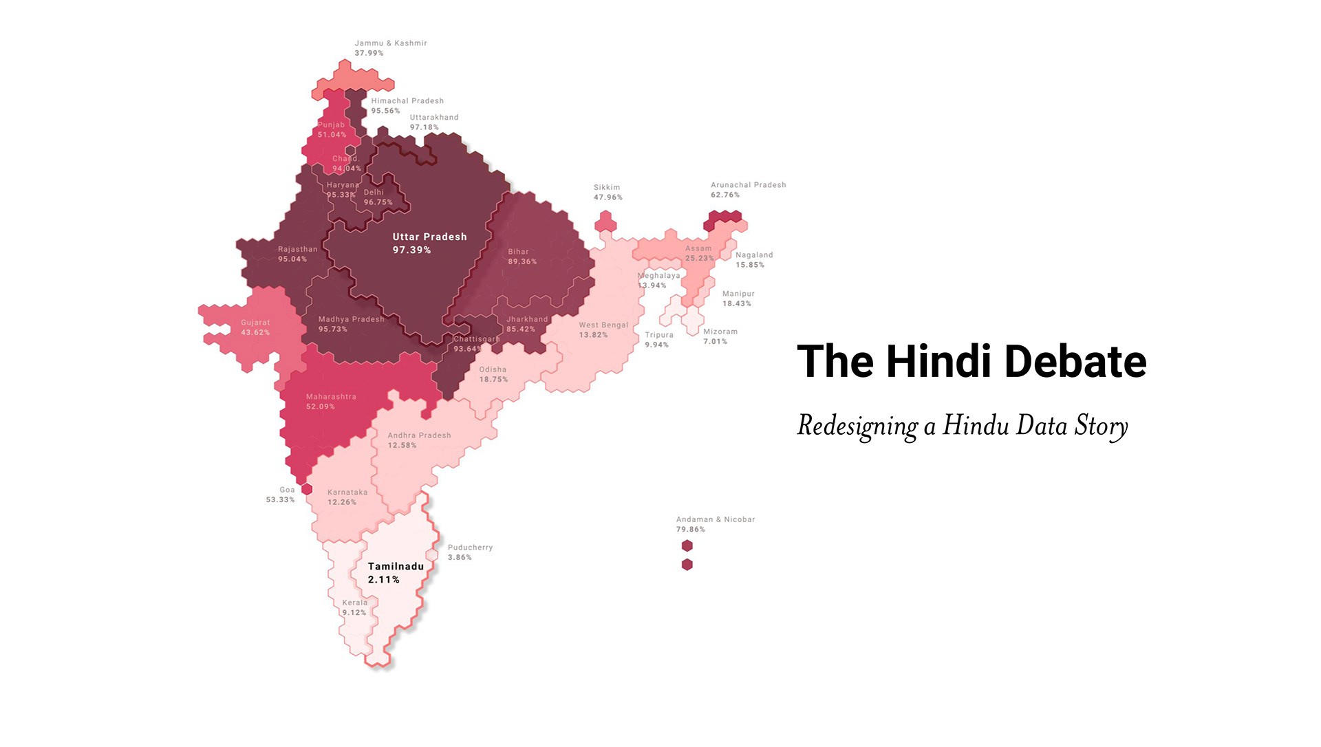
This was a data redesign exercise exploring data visualisation to understand the debate around 'Hindi' in India. The final result is a serires of visualisations answering three questions. Below is a quick overview and the final outcome.
overview
This was a data visualisation project under Rasagya Sharma and Venkatesh Rajamanickam where we were asked to redesign a published article from The Hindu without changing its core message. The article explored the distribution of Hindi speakers across India and the political sensitivity around it. My goal was to make the story clearer and bring out nuance while grounding it in verified data. I went back to the original sources, checked the numbers, fixed inconsistencies, and rewrote parts of the narrative to remove bias. The structure was also rearranged to make the argument easier to follow, especially for someone encountering the topic for the first time.
On the visual side, I replaced dense charts with simpler encodings. The layout was designed to guide the reader through three main questions — how widely Hindi is spoken, where those speakers are concentrated, and how it compares to English usage across states.
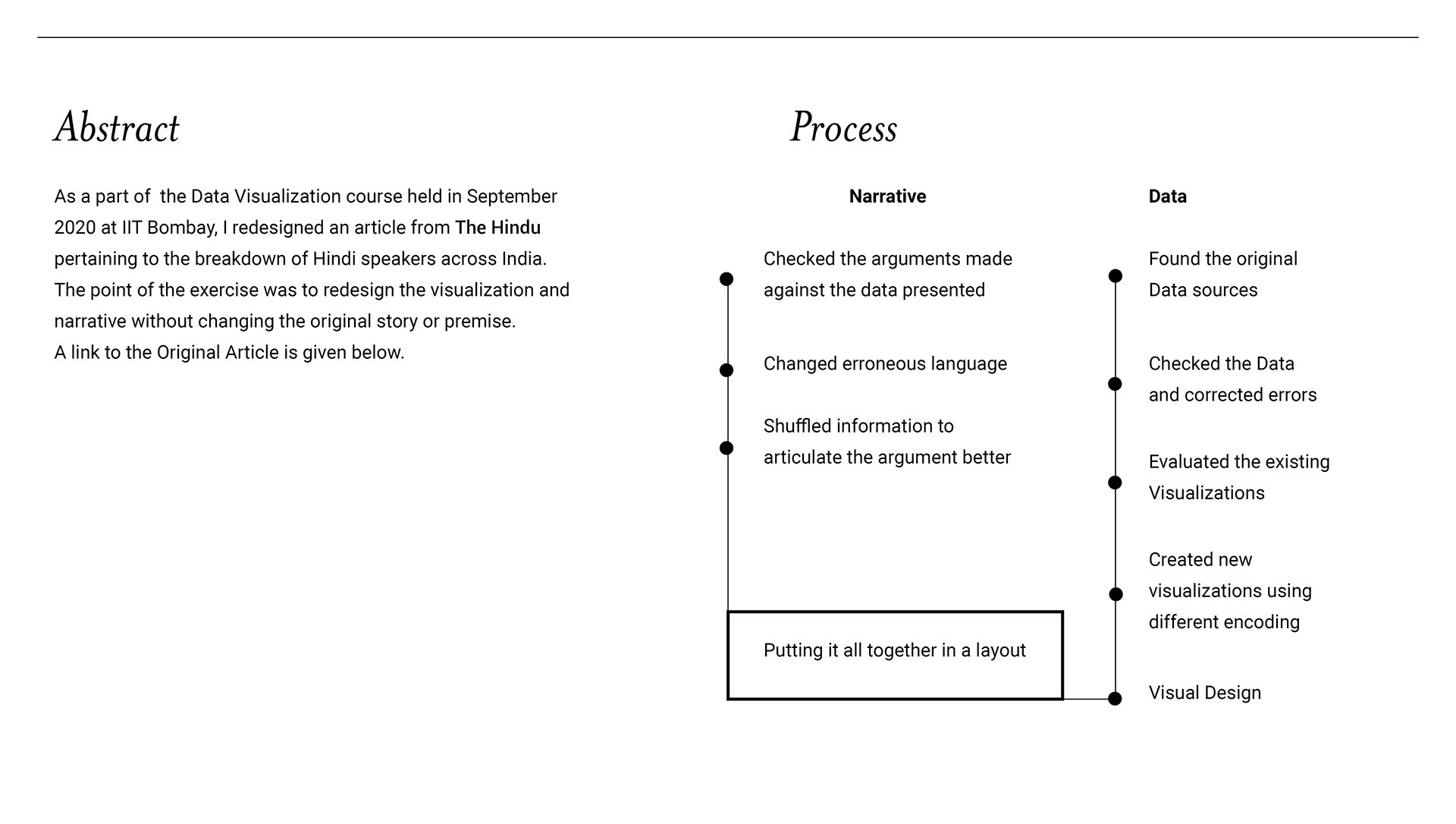
A quick visual of the process.
final outcome